We don’t have a front door, they said.
We like English beach huts, they said.
What do you think, they said?
Cliché as it is, ‘the rest is history’. Short of giving Ikea a run for their money and flat-packing a Bournemouth beach hut, shipping it around the globe and sandwiching it (is that even a word) in an ungainly fashion to the front of the client’s house, this is testament to how a small idea, tight budget, amazing family and super-cute collie, can ostensibly, make the equivalent come to life.
While it’s not hard for me to go off on a tangent nor lose myself in a string of unrelated analogies, I can almost understand how Mary Shelley felt as she wrote Frankenstein. OK, leaving aside the grotesque, sapient creature as the end product of unorthodox scientific experiments, this client has created a wonderful result from the desire to add a whole new dimension to their home and capture the essence of part of themselves they left 14,500 km’s away. Fortunately, it was created through a fairly orthodox approach and heap of council approvals!
It’s got that subtle cheekiness about it, much like the cool kid at school….“Yeah, I got it!”
 Without taking anything away from the design or idiosyncrasies of a small, simple build, there’s nothing ‘architectural’ or ‘clever’ about this addition, but it beholds so much more than the materials or space it occupies. In fairness, I had never thought this was something to write about; there’s really just not much there to comment on.
What captured me was how much time, love and thought had been put into it. True, the house did not have a front door – really, it didn’t. Access was to the side, straight into the dining area – don’t ask. So, of course, it was screaming like a child awaiting its next feed, for a blatant front door. If houses went to ‘homeschool’ and congregated in the playground at break, this one would have been teased for its lack of an obvious entry point; let’s just say it was late to blossom!
I am captivated by spaces that transcend the essence of design and construction to become something intangible to most, yet part of a family fabric. This is about them and how they live their work-life balance, which spills over into their home and is more about creating truly authentic spaces than getting lost in architectural ‘detail’. It’s not flawless and it’s not an overwrought grandiose vision; it is, quite simply, what they wanted.
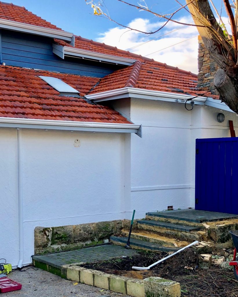
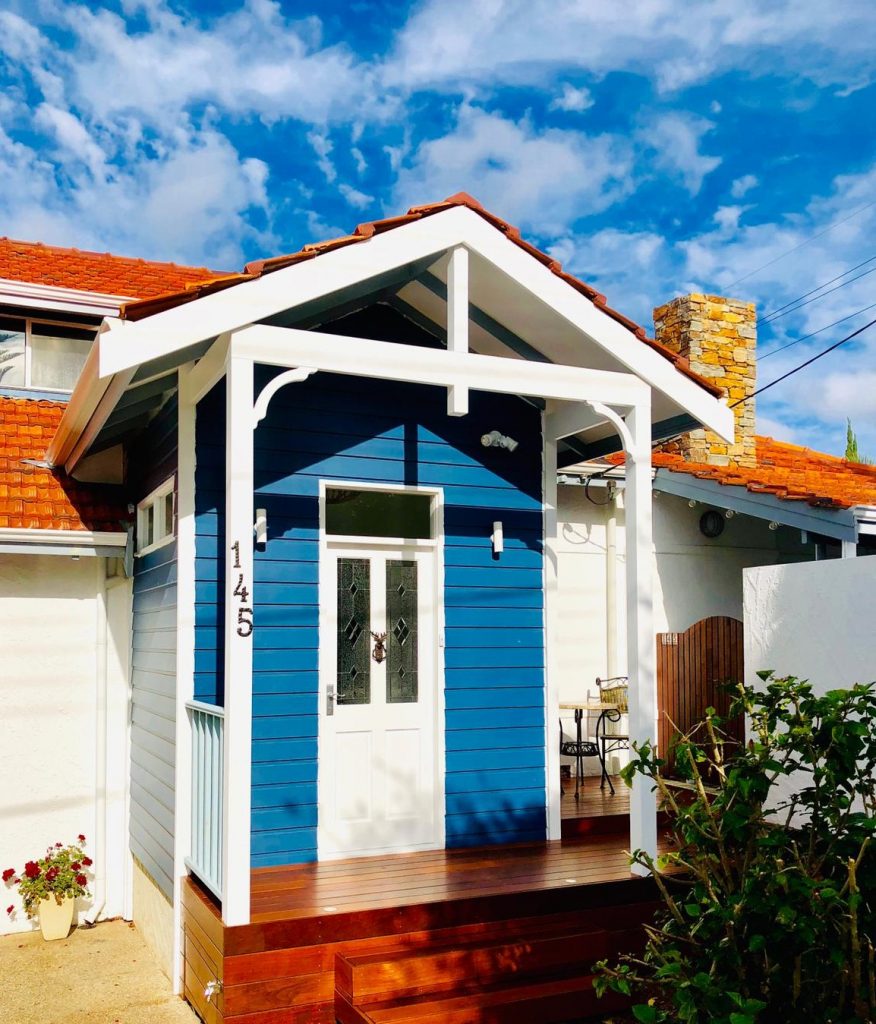
There were aspects of this project that were challenging, more so than many projects several times the size and budget, but as always, renovations throw up the most unlikely of proverbial hiccups that, on reflection, are repackaged as ‘challenges’ and digested as learning sent to make us stronger and more agile in the next build.
In terms of a design brief – it doesn’t get simpler. We need an entry that’s more than a doorway and set of welcoming steps. The beach hut comment is genuine and as a structure, it blends into the existing house without fuss and makes no apologies for the transformation it offers the building and the owners. It’s got that subtle cheekiness about it, much like the cool kid at school that has an air of confidence about them; “Yeah, I got it!”
It’s not flawless and it’s not an overwrought grandiose vision; it is, quite simply, what they wanted.
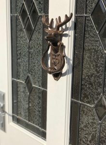
I’ve commented on this before, but small (and often inexpensive) ideas can make an overwhelming difference. And similar to a previous blog, it demonstrates the tangible benefits of working collaboratively in a project with the client and architect/designer. While we all would have liked to take credit for it, the clients made a last-minute decision to line the ceiling on the rake rather than stick with the plan and have a flat (albeit high) ceiling.
In hindsight, we could ponder why this wasn’t at obvious choice from the outset, but that’s the beauty of considering the building in the process as it slowly takes on a personality of its own; the cool kid just got cooler!
And in a bid to give the existing house something to brag about, a new skylight was added. Where the old one barely made the cut, offering a tad more glow than an 1840’s Victorian candle lantern, today’s protégé captured the northern light, catapulting it through the lofty roof space, fanning out into the kitchen to give it a new lease of life. Add to that a brave but perfect choice of floor tiles and the end result is a wonderfully magical space, both inside and out.
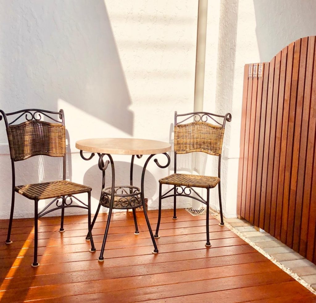
The decked area which could have been so easily paved to save just a few dollars now offers a quiet spot for an evening Gin & Tonic at a fraction of the cost as those served in Kalgoorlie! Although too many can be overwhelming for some!

A change from brick to timber in the build-up provided a neat storage area underneath the deck suitable for those random items that never seems to fit quietly in the garden shed; kayak, tent, spare roof tiles, misbehaving children.
I can see the entry is already more than just an expression of its namesake. It is a meeting point, somewhere to relax and the culmination of several smaller renovations which can now be enjoyed as one. For the family, the muddy boots and sandy thongs will take their seasonal place alongside damp paw prints on the new tiles.
For me, I smile at the thought of how much this project meant to the family and the joy it now brings to them; I imagine Mary Shelley would be envious!
Thanks for reading
Mark
I’ve read about ‘artistic license’ and from spending a number of my younger (even younger than now!) years embraced in the arms of an advertising agency, I became well accustomed to the phrase. Latterly, I realised it was a ‘creative’ way of justifying a headline or proposal, without the intent to offend or substantiate; the Mark Twain quote, ‘Never let the truth get in the way of a good story’, was basically a mantra. But I liked it, even if the Advertising Standards Authority preferred evidence-based proof and ‘8-point’ disclaimers.
So, my recent find comes with its own disclaimer: I may have used some creative license in the title but in no way was the preceding business, deemed to be trash – let the metaphor play out!
“Everything had its place and it had a reason for being there.”
Lily Bean opened last year, then suddenly closed earlier this year. Details are irrelevant, but it left an empty (albeit well appointed) space and a headache for the landlord (Kelly). Some would reach for the paracetamol, a leasing agent, and meditation App. But for Kelly, amongst other thoughts that I can’t reproduce on this site, she thought, why not reopen the café herself…and that my friends was exactly what she did.
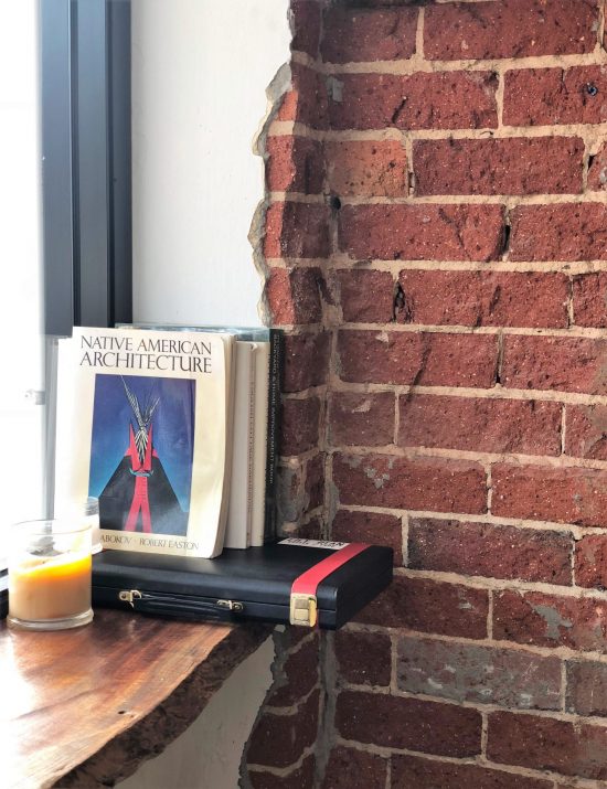
On paper, the design and finishes shouldn’t work.
One could portray the interior as slightly eclectic and quirky, almost thrown together. Yet, there’s more to it than that. The timber benchtops and exposed brick (yep, done well!), pressed tin counter front and antique mirrors live in a symbiotic relationship. I get the impression the backgammon set lodged against the window gets used and isn’t there simply for effect. In a pseudo-hypnotic state, I was drawn to flick through the pages of ‘Native American Architecture’…What the! Everything had its place and it had a reason for being there.
“They are like puppet-masters; the show just doesn’t work without them”.
Teapots and sugar bowls, which in another environment could be deemed kitsch, couldn’t have been chosen better. The contemporary exposed grey concrete floor is partly covered by antique rugs….RUGS! Who does that?! And, gets away with it!
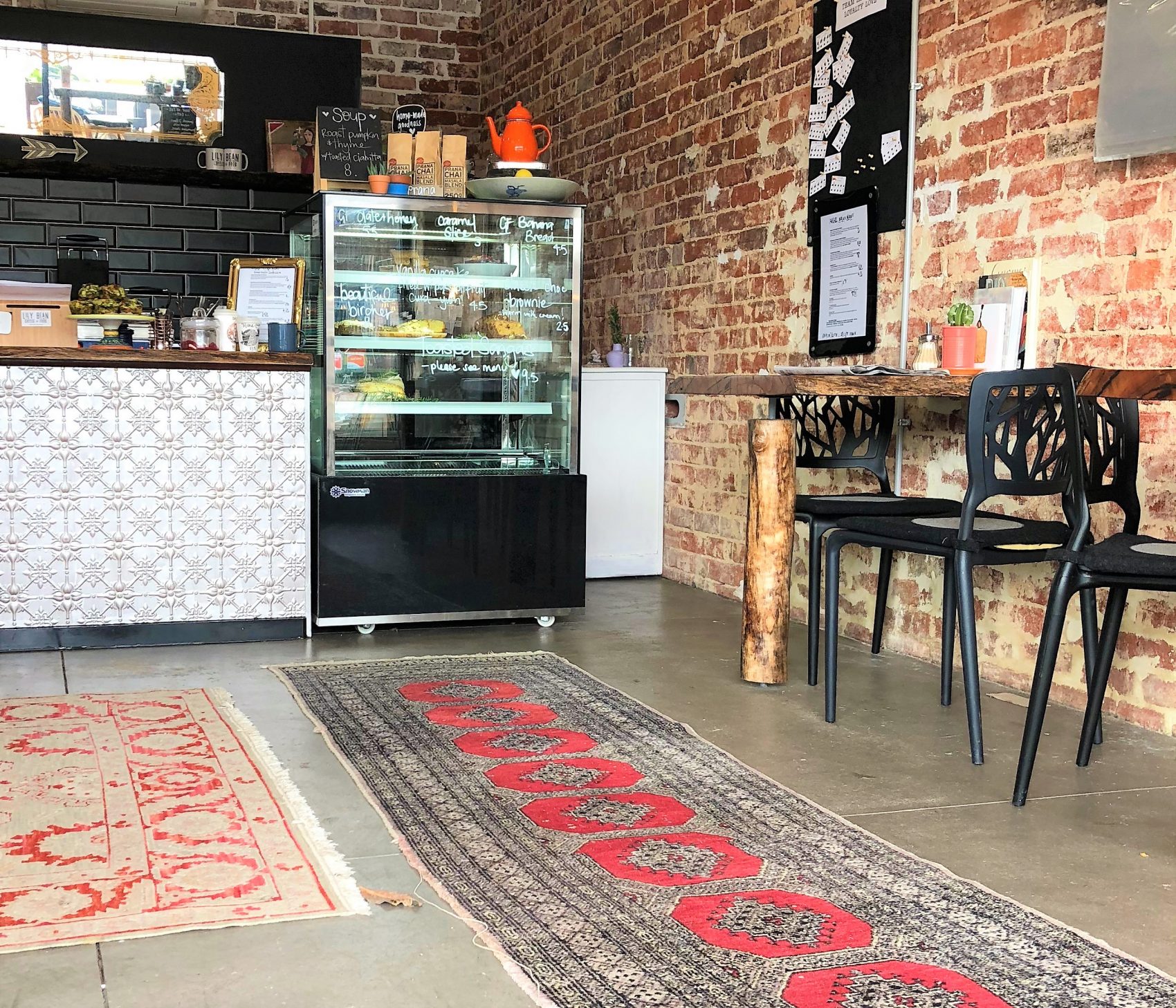
It feels like you’ve taken a step back in time yet the atmosphere is warm, inviting and far from ‘ye old’, with the average age of customer and staff combined, way below the age one would naturally expect from someone who owns a sofa my Nana would be proud of.
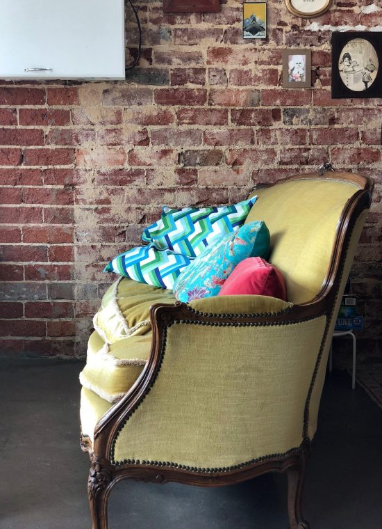

I see a reoccurring theme with the few coffee shops I’ve written about recently. While the design and ‘renovation’ of the building is what I’m fundamentally interested in, it’s the staff that makes it all come together. They are like puppet-masters; the show just doesn’t work without them.

Customers names are brandished around in a cool American accent by a hair-free* barista. Brooks (really, cool name!) is cheerfully entertaining the customers alongside Zoe and Aimee, with smiles most cosmetic dental surgeries would pay to have on their advertising.
*I refer merely to facial hair. The cap could be concealing a further hair-free zone and as for the rest of him, that’s beyond my comprehension.
I recognise that my journalistic efforts are merely for personal enjoyment and I have more chance of being selected for the Cornish accolade of ‘Best Cream Tea 2018’ than winning a Pulitzer prize, but I find inspiration in certain places to write, work, read. Some just make you feel like hanging around for a while; some inadvertently encourage you to leave. Here I like to stay.
Even the selection of music feels like they’ve meticulously picked each song, with Spotify and Soundcloud nowhere in sight.
I hear laughter from customers and staff alike – it feels like a piece of ‘home’, even if the sofa, cane chairs (sprayed gold!) and rugs may not work together so well at home.
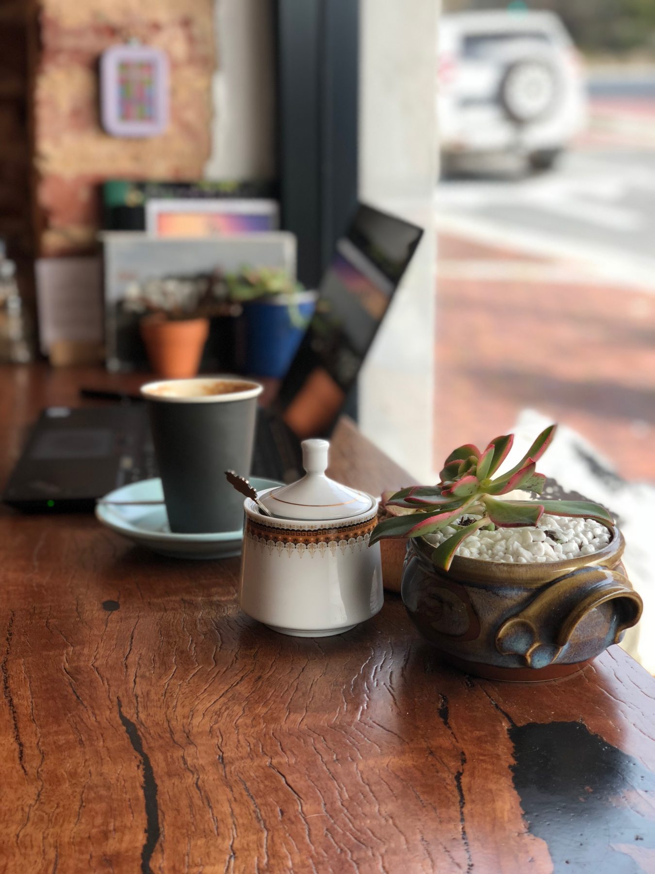
While I rarely make comment on the coffee or food selection (my culinary counterparts do that all too well), I couldn’t help but notice that the muffins are ‘made with love’.
A statement on the menu, which feels totally genuine – I think they might indeed love making them. In a children’s fantasy the muffins would have personalities of their own and run the coffee shop, everyone would love them and the ‘Santa Clause / Donna Hay combo-character’ would be the ever-cheerful baker making lives happier by the day. Crikey, even that’s pushing the limit of ‘artistic licence’ but you see my point.
The Coffee Saloons in the UK (see previous article – ‘A New Sheriff in Town’) would love this place, it’s how they see the world of coffee too.
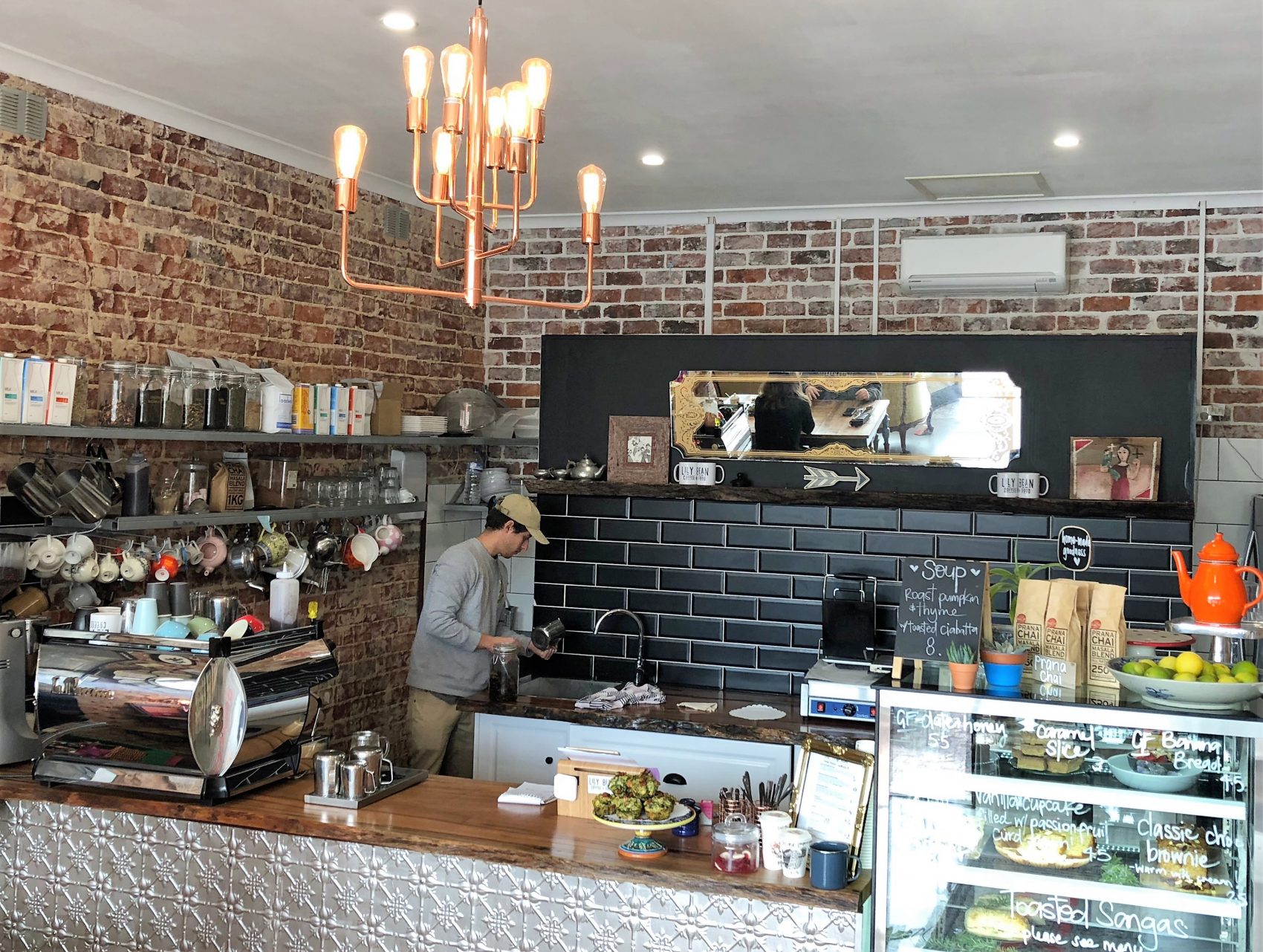
I’m far from anti-establishment and don’t go out of my way to find occasional designs or sites than shun the ‘norm’, but I do get a kick out of seeing something that most designers would struggle to comprehend in a non-critical manner.
There’s usually a single item that stands out…the first impression…the Jerry Maguire ‘You had me at Hello’…but at Lily Bean, I’d be hard-pressed to pinpoint one thing. Push me and I’m split between the brickwork and timber, but in isolation, they would be bland. Here it all melds together as a single impression.
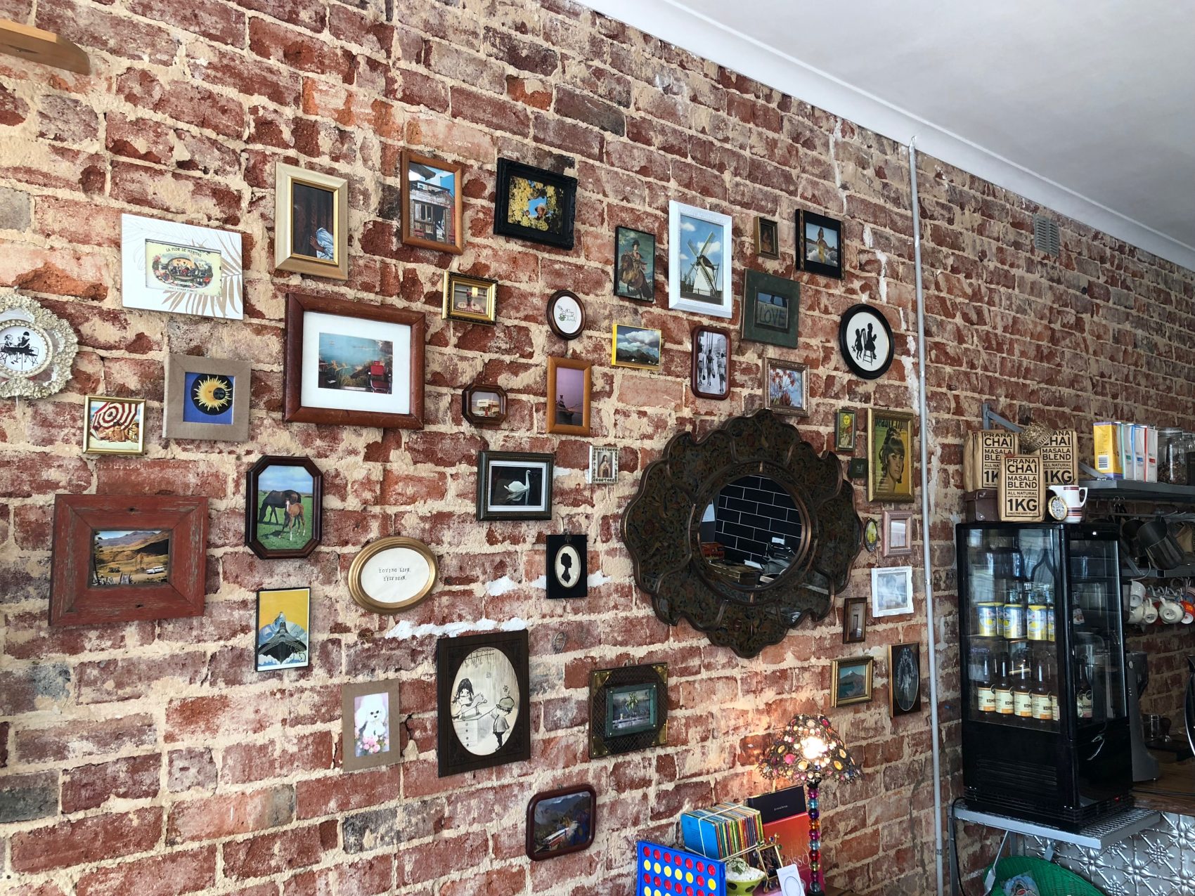
Hats off to the team, I’m looking forward to coming back for a game of Backgammon, Connect Four and getting lost in my Nana’s sofa for quite some time.
The old adage of a little makes a big difference rings truer in some instances than others. And never a truer case than in this renovation of a kitchen/dining area (the kitchen cabinets remained but everything else was up for grabs). I’d add, that the ensuite, laundry, powder room and master bedroom had a full re-work too and without taking anything away from the net result (you’ll love the ensuite transformation), I wanted to focus on the kitchen for if it was a culinary dish it would most definitely be the piece de resistance. For clarity, the figures mentioned below refer to the kitchen and associated works in isolation.
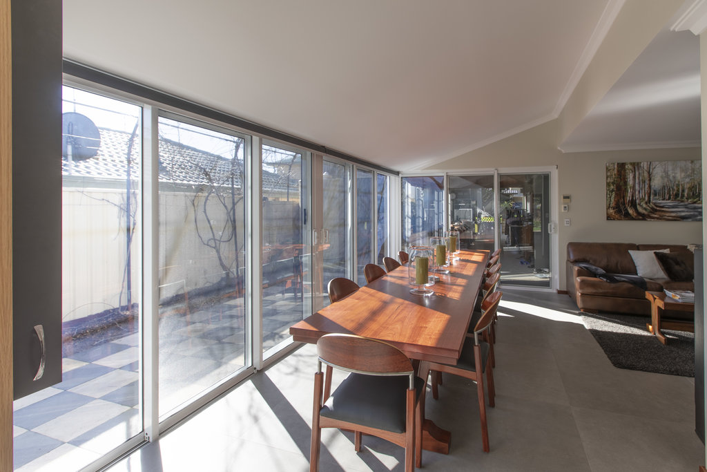
While added space was a prerequisite, light was a necessity too.
When we talk about adding space, I speculate that few would consider a scope of works with less than 15-20 square meters (sqm). If the Olympic committee pondered introducing non-sporting events in the Games and settled on an event for the least square meterage added in a structural renovation, then aside from the entire committee being fired for completely losing their marbles, hands down this project would be proudly representing Australia with a podium finish clearly in sight! Wait for it….a smidge over 4sqm!
“Mathematically, they’ve managed to take 2 + 2 and arrive at 5”.
Now, before you jump back to my previous blog ‘How Much per sqm Please?!’, this one safely sits in a box of its own; entirely making the premise of sqm ballparks null-and-void in renovating terms. For surely the Guinness Book of Records would be knocking on the door if equations alone took the place of judges, pitching this renovation at around $32,500 per sqm – gold!
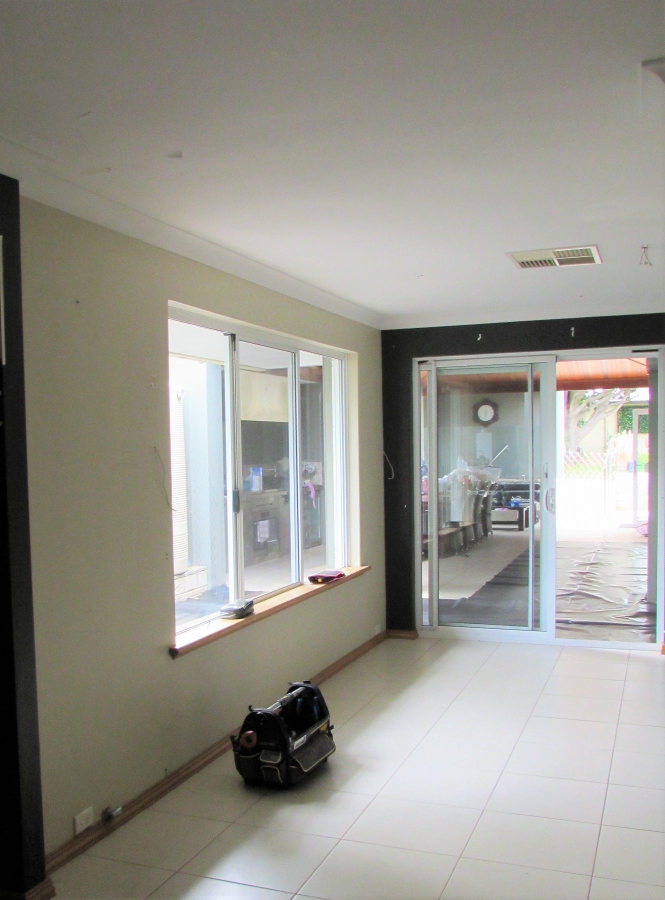
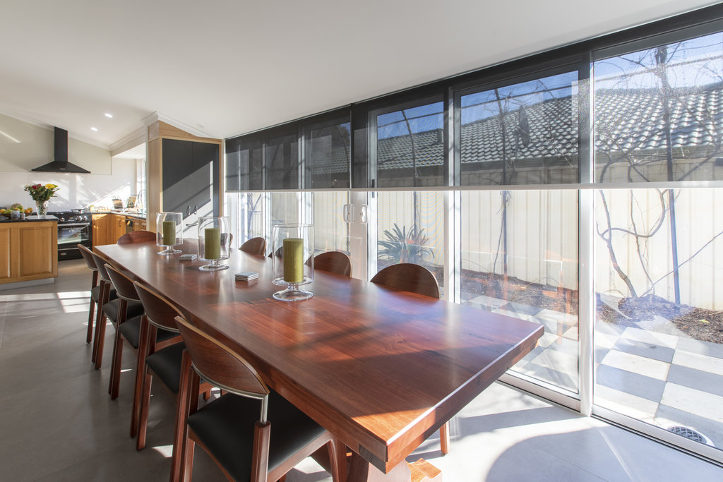
What makes it truly special was the client’s idea (dare I say it, genius, or tantamount to highly creative, idea) to rake part of the ceiling where the existing roofline intersected the second storey juncture, in a bold move to utilise the existing structure and change the entire dynamic of the space below.
Not only did the floor plan gain 4sqm, the ceiling ‘space’ in the same area jumped nearly 13sqm. It’s the equivalent of doing an attic conversion, without the attic!
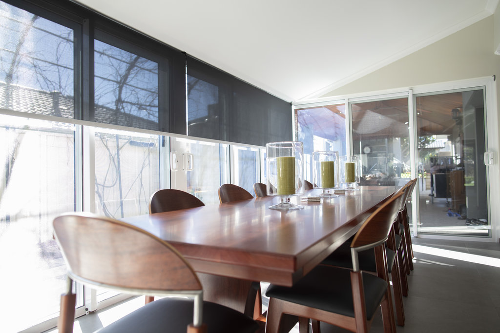
Back to the high-value land-grab and what they gained in extra floor area. As is common-place in many renovations, stacker doors (terrific job by the guys and girls at SV Glass) provided the opportunity to increase light dramatically while creating a new dining area, allowing the old dingy and cramped dining space to be converted into a walk-in pantry. Mathematically, they’ve managed to take 2 + 2 and arrive at 5.
Where what you can’t see makes what you can see possible then here, the detail is fundamentally hidden. To maximise the extent to which the existing floor could be increased (simply to the edge of the existing eaves-line ie. 700mm) three steel columns picked up a narrow overhead beam enabling the door height to remain consistent and the structure of the roof to be notched into the beam, with little alterations in the roof space.
“Simple ideas can function brilliantly”.
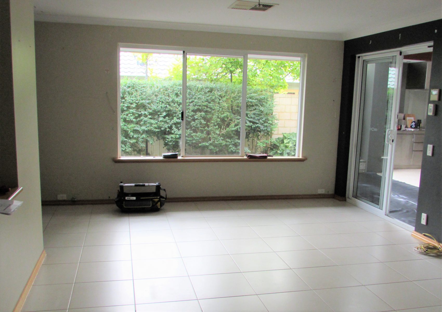
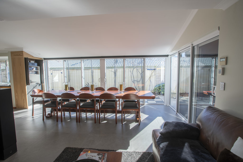
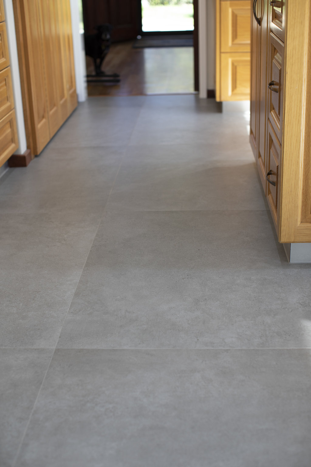
At ground level, the sills were recessed into the concrete with only 1mm tolerance, to marry up with new tiles and a flush exit. The Kerlite tiles are 1000mm x 1000mm and only 3.5mm thick (thin!), laid directly onto the existing floor tiles, so, little room for error. For those that haven’t seen these tiles before, they’re pretty cool! While not a ‘cheap’ option per se, they have a distinct advantage of being able to be laid directly onto existing tiles and due to their ‘thinness’, doors don’t need trimming and levels are only slightly affected. From a technical perspective, they are environmentally-friendly, being fired in non-Co2 generating kilns, ceramic, perfectly flat and easy to work with. Check them out here.
The raked ceiling finishes snugly above the door heads and propels the newly invited light upwards, creating a feeling of space far greater than the area itself permits.
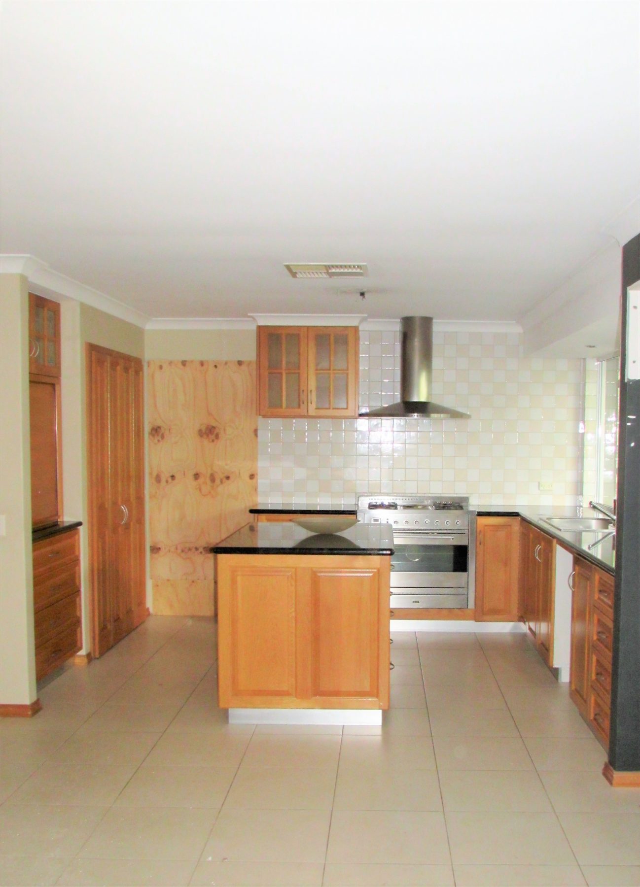
What appeals significantly about this renovation is that the kitchen cabinets and benchtops, usually king of the domain, remained untouched while the entire focus was on generating light and reinventing the space around them. It’s often easy to overlook transforming ideas or indeed not see them in the first place.
As mentioned, while playing ‘second fiddle’ to the kitchen, I couldn’t end without further mention of the ensuite transformation. It’s a renovation equivalent of Hans Christian Andersen’s Ugly Duckling!
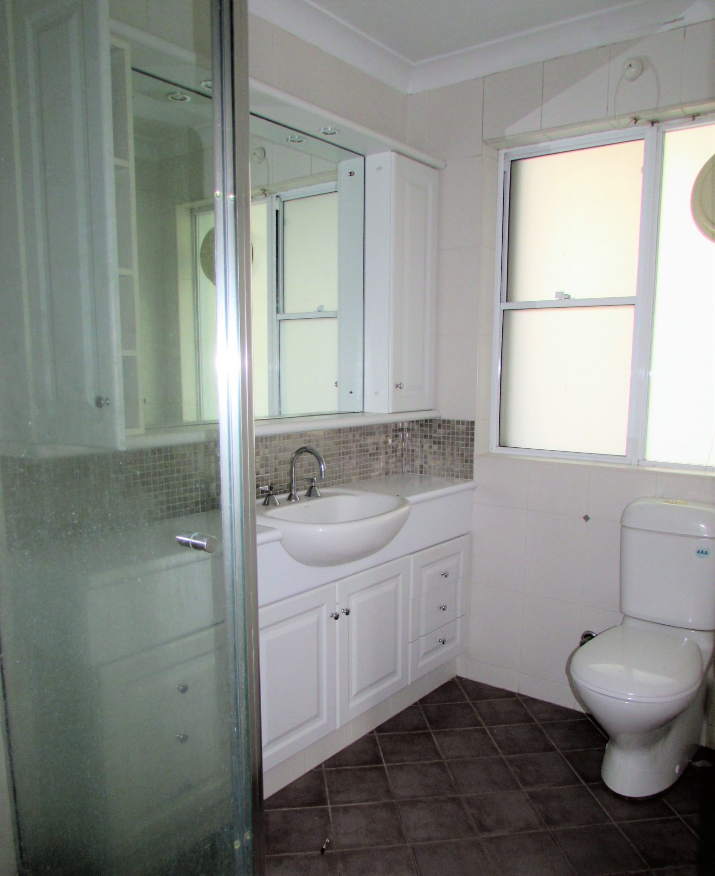
The original ensuite was, in fairness, the other half of the ‘walk-in-robe/ensuite’ combo, It sat fairly uncomfortably off the WIR in a dated and cramped fashion and while it provided all the amenities required of it, there was little room to navigate between the shower, vanity and WC without risk of potential injury.
The plan involved removing a doorway and part of the wall to open up the entire area and relocate the robe space to the master bedroom, which was more than accommodating and welcomed it without fuss.
Removal of the existing windows and concrete slab, enabled a remodelling exercise most cosmetic beauty salons would be proud of. Bigger windows, new plumbing, drop-ceiling, bench seating and floor-to-ceiling tiling have assisted in making this much more than a make-over and most definitely a younger model.
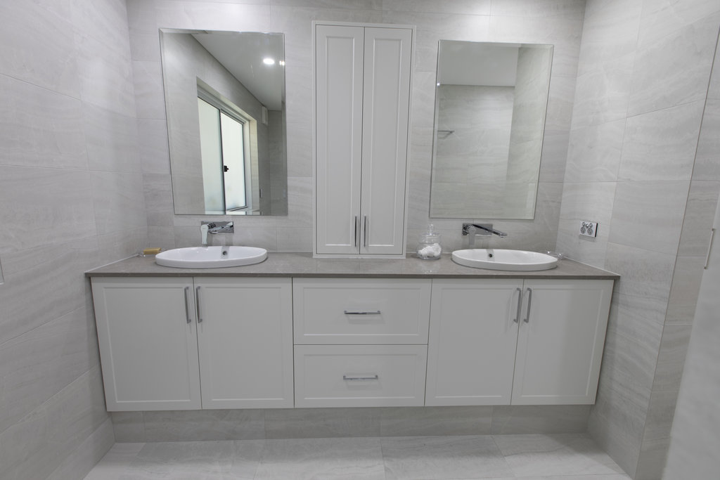
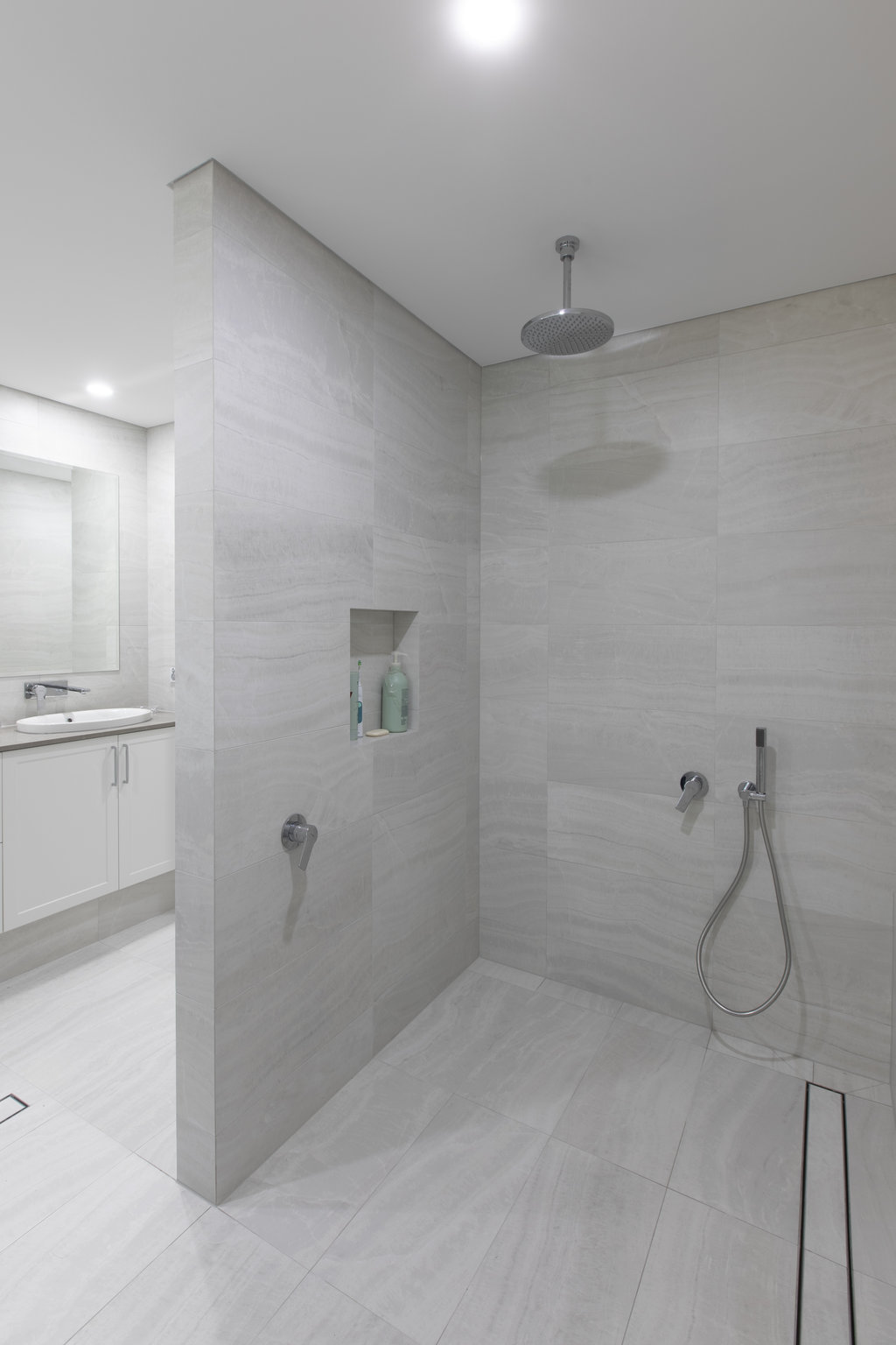
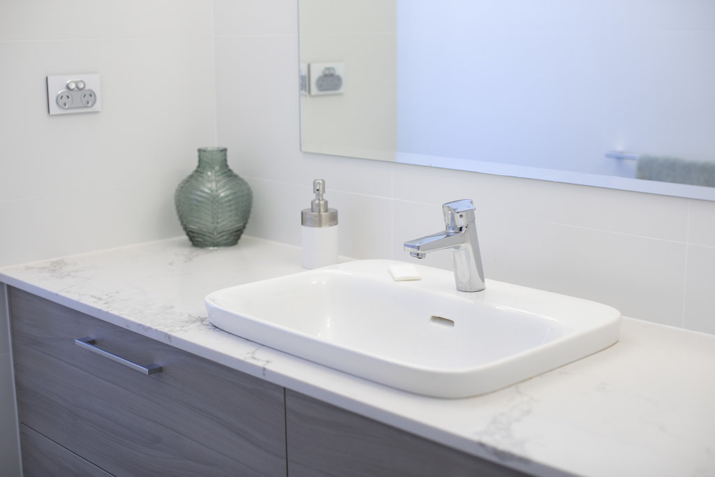
Both the works in the kitchen and the ensuite, show that creativity in design comes from many places and isn’t the sole domain of an architect, designer or builder. Simple ideas can function brilliantly, spaces can be transformed without great expense and kitchen renovations don’t always involve new kitchens!
If you hear the words ‘It’ll be alright mate’ from your builder, head for the door...
They say that success is 50% luck. So, by all accounts I was lucky the day I bumped into the owners of this Cottesloe home in a local coffee shop who, a few months later, became clients and one of Barefoot’s first projects.
I say this, and highlight the additional costs involved in the renovating/buy-and-sell process, only to clarify the overall profits that may be possible might be less than anticipated and for the first-time ‘flippers’ to be fully aware of the true costs which are often conveniently left out of the media.
Undoubtedly the most common question asked and yet the most tenuous to provide a satisfactory reply. Can I answer this without the use of the “How long’s a piece of string” line….? Nope!
I looked up the Cambridge English Dictionary definition for ‘penchant’. While I knew the general meaning and how to contextualise it, I read that it’s “a liking for, an enjoyment of, or a habit of doing something, especially something that other people might not like.”
It’s difficult to write this without a) employing a litany of clichés, and b) keeping it to one side of A4; nonetheless I shall try!
Barefoot has come into existence following nearly eight years in the residential building industry after establishing Castleprime Construction in 2008 along with a business partner. Subsequently, while Castleprime continues as a trading entity, the partners decided they wanted to pursue some individual projects and for my part, Barefoot Renovations was born.
Having started out with Castleprime in renovations and additions, we quickly fell into the bespoke, architect-designed, new build sector.
While the upper-end projects provided a unique set of challenges and rewards, there came with it a fair amount of contractual bureaucracy, immense paper trails and constant realignment of client expectations.
A number of things emerged as a result, which has driven the ethos of Barefoot.
Simply put, it’s our culture that differentiates us. Everyone on the team has the same focus and desire to make the experience enjoyable and professional.
It’s about how we want to do business. We established Barefoot with the goal of creating great spaces and taking our clients on a journey along the way.
The day we stop doing this is the day we shut the doors and look for an alternative career!
Undoubtedly the most common question asked and yet the most tenuous to provide a satisfactory reply. Can I answer this without the use of the “How long’s a piece of string” line....? Nope!
This by no means is supposed to be a flippant reply and everyone who’s asked me the question always follows it up with a second questions along the lines of, “Come-on, just roughly, what do you reckon?”
So before I give a level of reasoning from which you can deduce your own square meterage, let me put some context around the question. Firstly, m2 rates only really came about in relation to new homes, where it’s far easier to be definitive with the ‘construction & content’ of the building. Also, for the average floor area whether single or double-storey, it’s more reliable to offer a comparison between designs and builders. But, when it comes to renovations, the system simply doesn’t work.
The type of work involved in a renovation is so different from project to project that any comparison is nigh-on impossible.
Renovations can be both structural and non-structural. Maybe we can differentiate between renovations and additions….but then again many renovations still have structural components.
As an example, a recent internal non-structural renovation of a bathroom, laundry and ensuite, with simple detailing and economical fixtures and fitting totalling 15m2, would equate to $2,500 per m2 whereas an extension to an existing house with structural works (albeit a pretty high spec) totalling 120m2 equated to $5,416 per m2.
Introducing the ever-versatile ‘Car Analogy’!
Assume for a moment we’ve established the requirement for a three-door, hatchback with leather interior and a sporty engine. That narrows the field down considerably. So, upon entering a car dealer’s showroom, let’s pose the question “How much for a three-door, hatchback with leather interior and a sporty engine?”
I’d be surprised if an answer would be given, but for the odd salesman trying their luck, I would hazard a guess of somewhere between $25,000 and $125,000…plus!
In general I’d imagine most people would agree it’s hard to answer without first conquering a tranche of questions, from which the salesperson can more accurately direct the customer.
But, without labouring the point too much, let’s consider the design and detailing which differentiates the $25,000 car from its $125,000 counterpart. If we merely focus on a single component, we have a raft of questions to get through….
Alloy wheels? (run with me and assume ‘yes’)
Any specific brand?
What size – diameter & width?
Pitch circle diameter?
Load rating?
Offset?
Weight?
How many wheel bolts and what pattern?
What style of bolts?
What style of rim?
How many spokes?
Milled spokes or cut face?
What ‘colour’?
Carbon?
What type of driving are you planning to do?
What type of tyres do you want on them?
Based on answers the wheels alone would easily vary from between $400 and $5,000 a set.
So back to the renovation…and focussing on one component – ‘electrical’…..
What type of light fittings (LED down-lights vary in cost from $35.00 - $125.00 and pendants are anything from $40.00 - $2,000 +)?
Type of GPO’s – slim-line, block mounted, brushed aluminium cover plates, white plastic?
How many and location of each?
Condition of existing wiring – any upgrade of the meter box required?
Any three-phase power required?
What type/model of cooker, hob, air-conditioning, ceiling fans?
Photovoltaic cells?
Data points required – do you need a hub?
Free-to-air TV / Foxtel?
Security?
External power and lighting requirements?
Reticulation?
I could go on…you get the picture!
OK, so all that said, can we be realistic by stating a m2 rate? Invariably, I’d be very hesitant unless there’s sufficient detail in the plans, specification and following a thorough inspection (including an engineer’s report) of the property and without making allowances for possible unknowns.
However, a couple of years ago I rewrote an article for the Master Builders Association’s website, covering renovation costs to try and bring a better expectation to possible m2 rates. In it I suggested working on between $2,500 and $4,000 per m2 including GST. But even now, I think these figures would be conservative depending on the scope of works and property condition.
Furthermore, I am increasingly trying to re-educate clients and get away from entering into a conversation where m2 rates are banded around.
I’d be more inclined to advise clients to consider the project in its entirety and ensure they get a thorough set of plans and specifications. Working with a company that can provide the design and development of the plans as part of the service will provide a better outcome as they will have a thorough understanding of the project, home and budget.
Plus, always plan for some unknowns when budgeting, it seems to impact well on m2 rates and they have an uncanny knack of making themselves known at the most inconvenient times!
[/mp_span]
[/mp_row]